Design should be accessible.
Design should be accessible.
— Waarzitwatin.nl
About
‘Waar zit wat in’ which means ‘What is in it?’ The websites name is under the authority of VeiligheidNL and RIVM. With the support of the Ministry of Health, Welfare and Sport (VWS) and the Ministry of Infrastructure and Water Management (I & W), Grrr build a website. The question was to create a website where Dutch citizens find quick and easy, reliable, and practical information about domestic chemical products.
Two years ago the site had a soft launch. The reason was to test with users and create content.
How do you design an accessible website?
My role
UX
Prototyping
Visual
Briefing
After testing with users and the importance of accessibility, a need arose to make the website 100% inclusive. Also, since 1 July 2018, websites and mobile apps from the government must meet the accessibility requirements according to a step-by-step plan.
The first branding and design of the website didn't stick to the rules. My role was to add new features, make it future proof creating the design system, and last most important make it accessible.
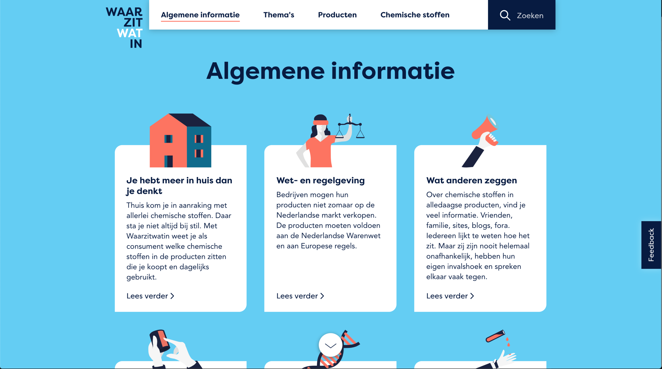
UX design
In two years, a lot can change. How we think, how we browse and what device we use. Therefore it's always useful to evaluate any website every once in a while. That's what we did with waarzitwatin.nl. Here you can find some learnings.
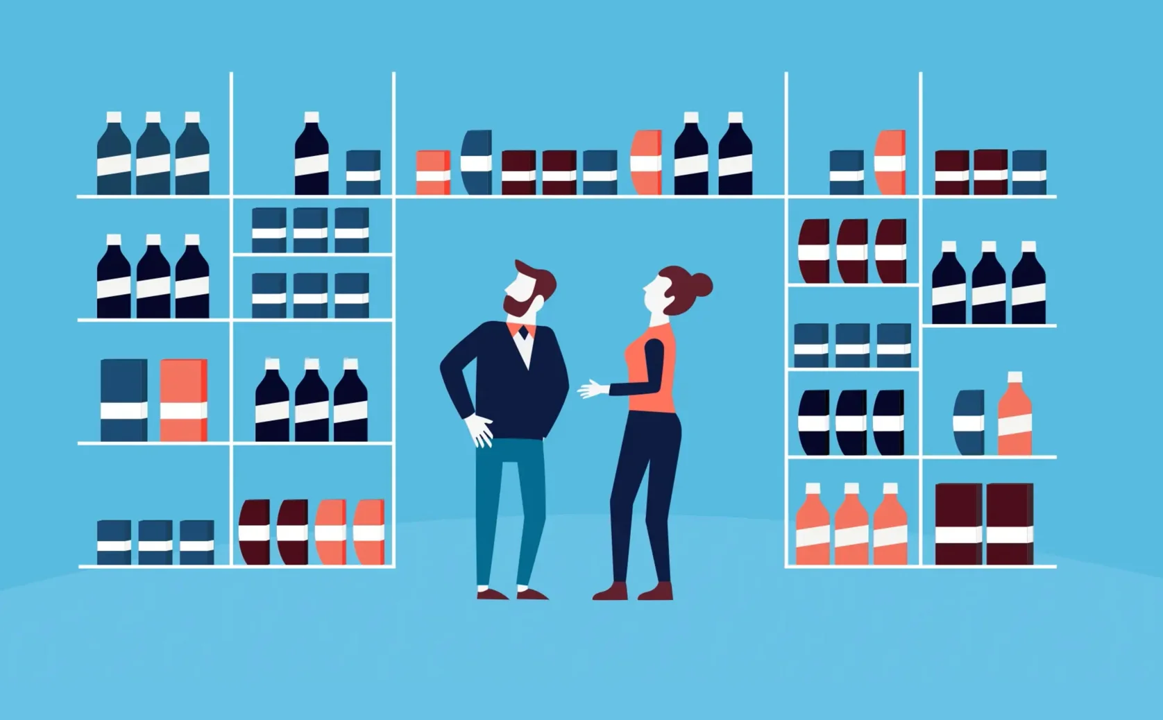
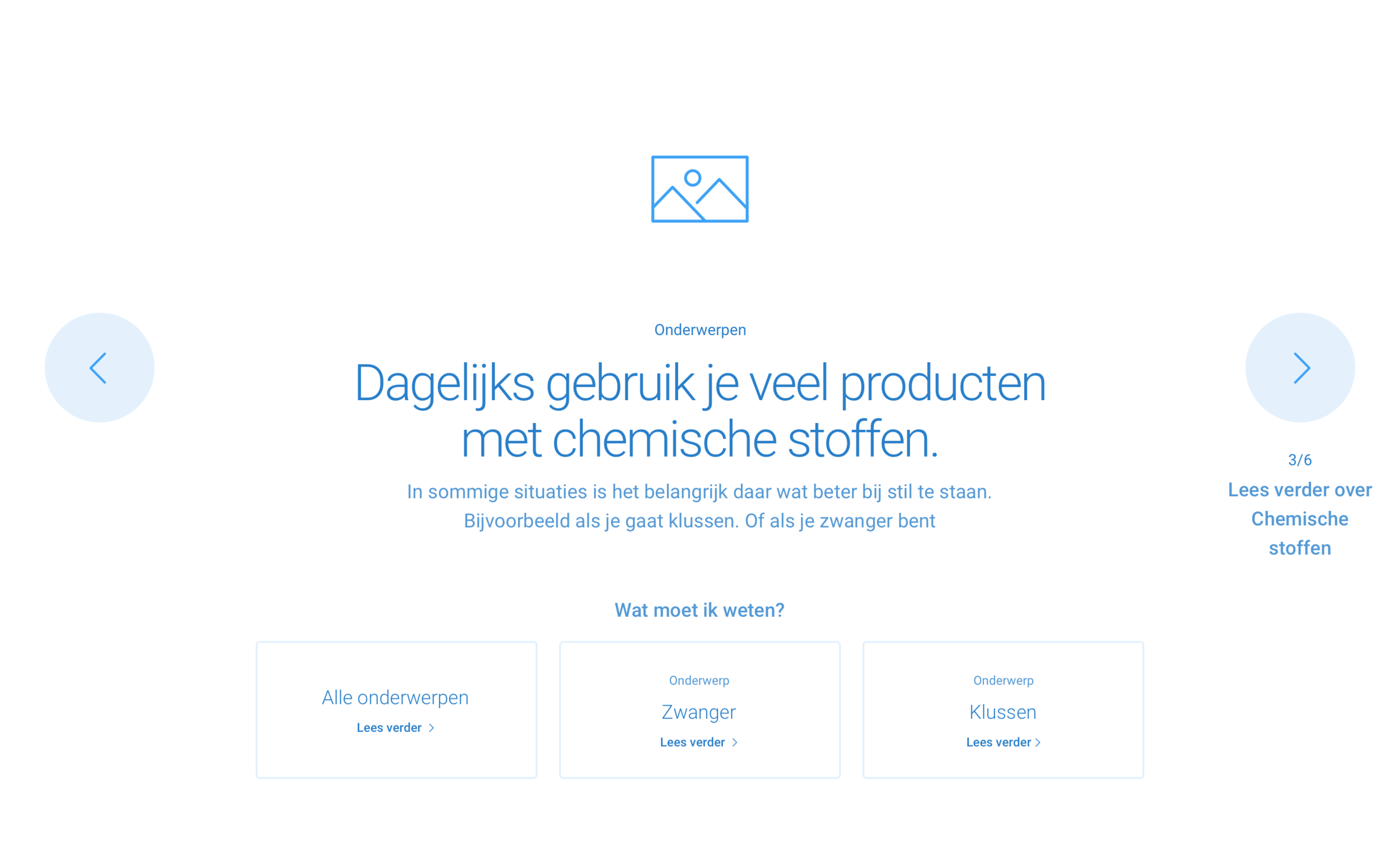
We can separate Waarzitwat.nl users into two users groups: One group search for the answers. Another group doesn't know what they're looking for, and therefore wants to be inspired. One group enters the website through organic search, or other extern websites landing on the detail page, while the other group comes through the home page. During the tests, we found out that the home page was cut in too many parts causing the users to lose their interest.
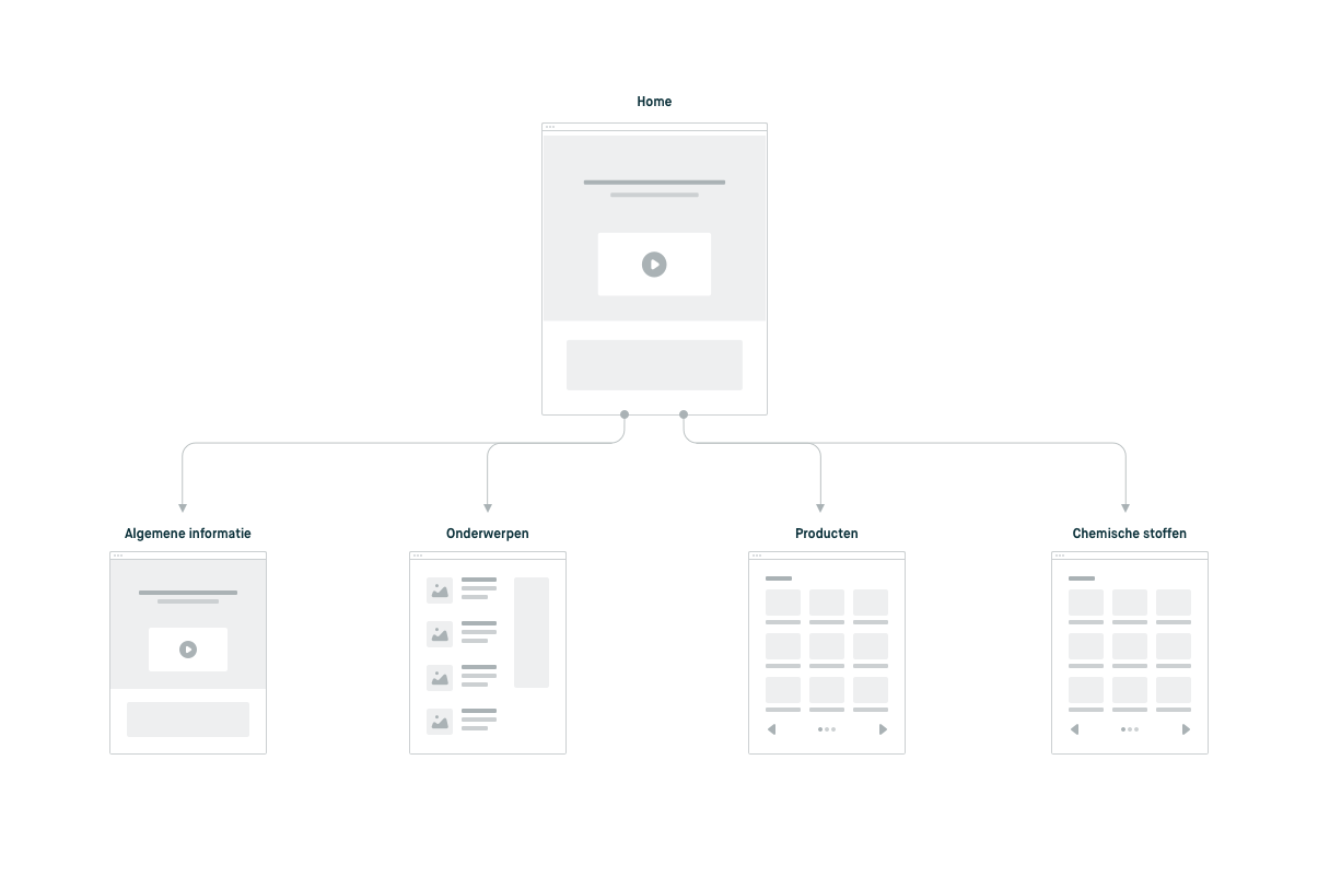
Therefore we stepped back and decided to go back to wireframes. This way, we could focus on the content and behavior instead of design. The first thing we did was removing the unnecessary blocks (I call this noise) this way the page would be shorter and more transparent. The home page would have an interactive onboarding part that would introduce the user's into daily subjects. The challenge was to make an engaging, playful, but also accessible bock.
Prototyping
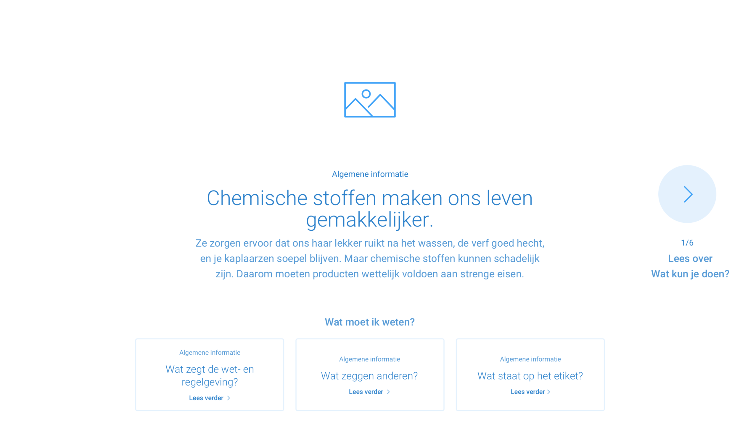
While creating wireframes, I like to test the concept with quick prototypes. I show them to the team so we can check the usability, accessibility, and technical difficulty. When you check accessibility in wireframes phase, it's essential to look out for simple mistakes as anti-patterns. Therefore when you create new functionality, try not to rethink the wheel, but combine what you know. While creating the interactive onboarding block, the challenge was to keep the users focused on the content but also informed where the users were.
Below you can download two prototypes of the interactive onboarding block. One has top navigation, and the second one doesn't. On the waarzitwatin.nl you can see what the result is. *Note that Principle prototype is a Mac app and can be opened only with a Mac. (open the app by control-clicking the app icon and click "open")
Subtle detail: look how nice the illustrations animate.
UI design
While designing for accessibility, there are many things that we designers should keep in mind. On a website where information plays an essential role, the text hierarchy should be clear (think about the text readers). Every page should start with one H1, and you shouldn't jump from H2 into H5. If you are interested in accessibility, you can read this.
Another essential factor for good readability is contrast and font size. The first version of Waarzitwatin.nl website didn't pass most of the contrast checks. After a few colors, text sizes, and hover changes, I can now say proudly that the site is 100% accessible.
Previous version home
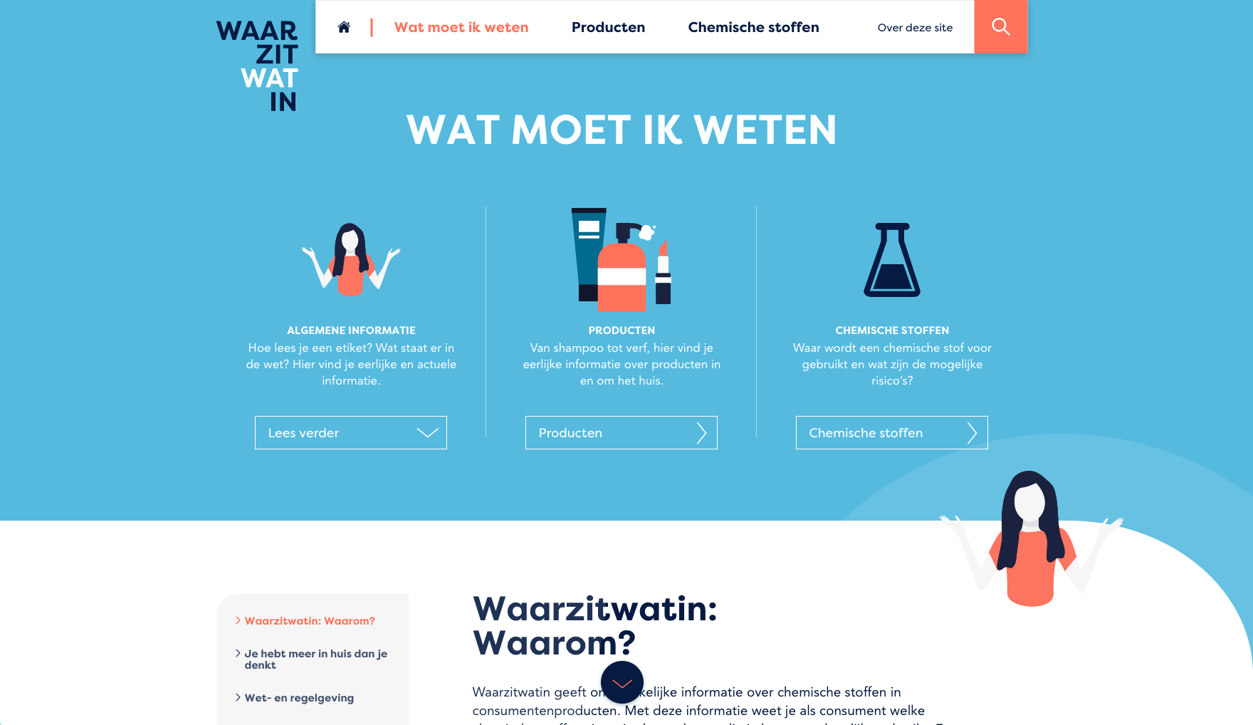
Previous version About
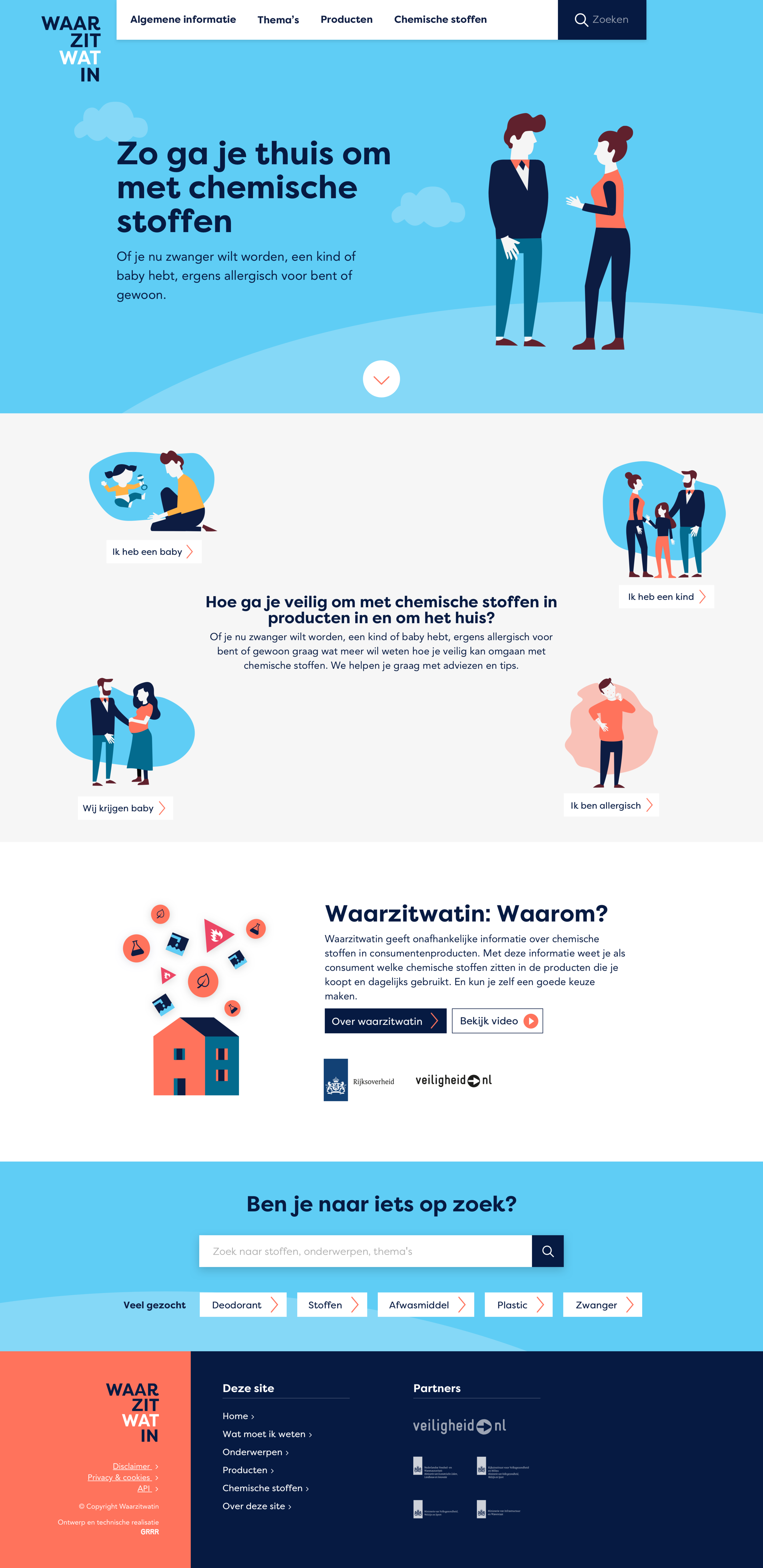
Current version home
Current version About
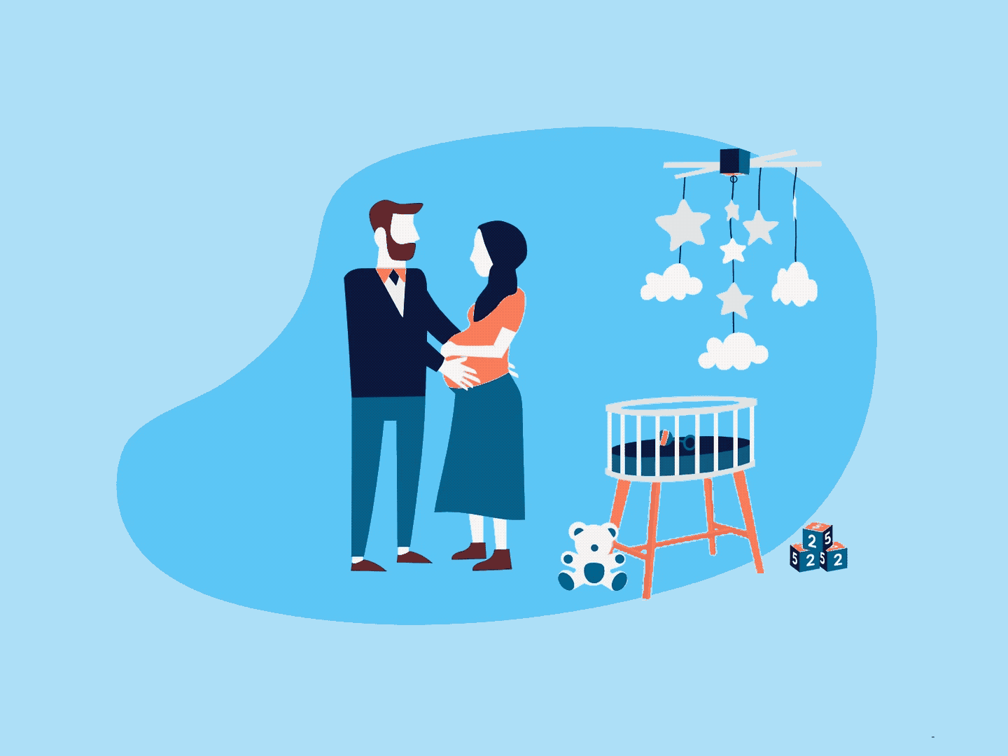
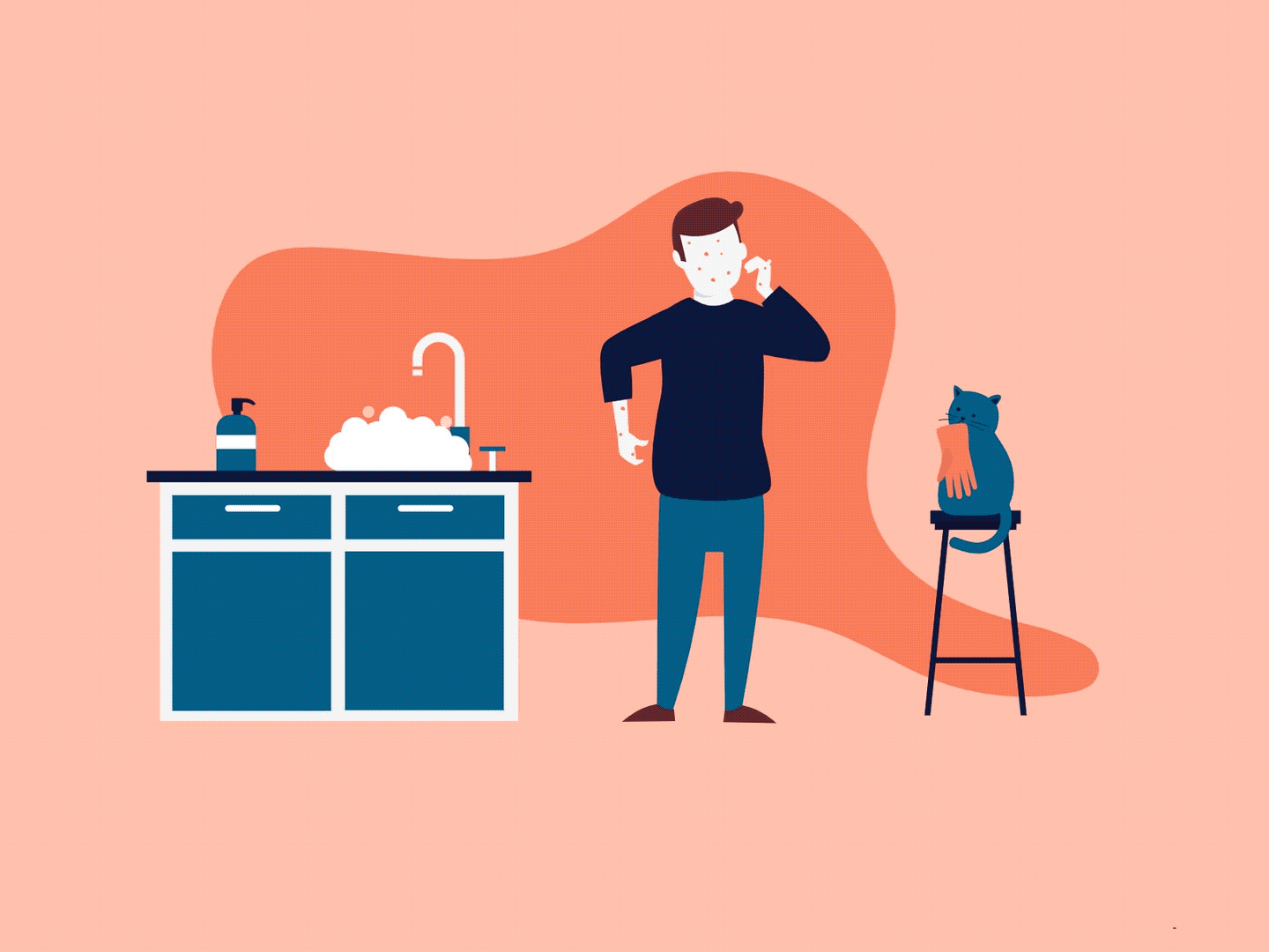
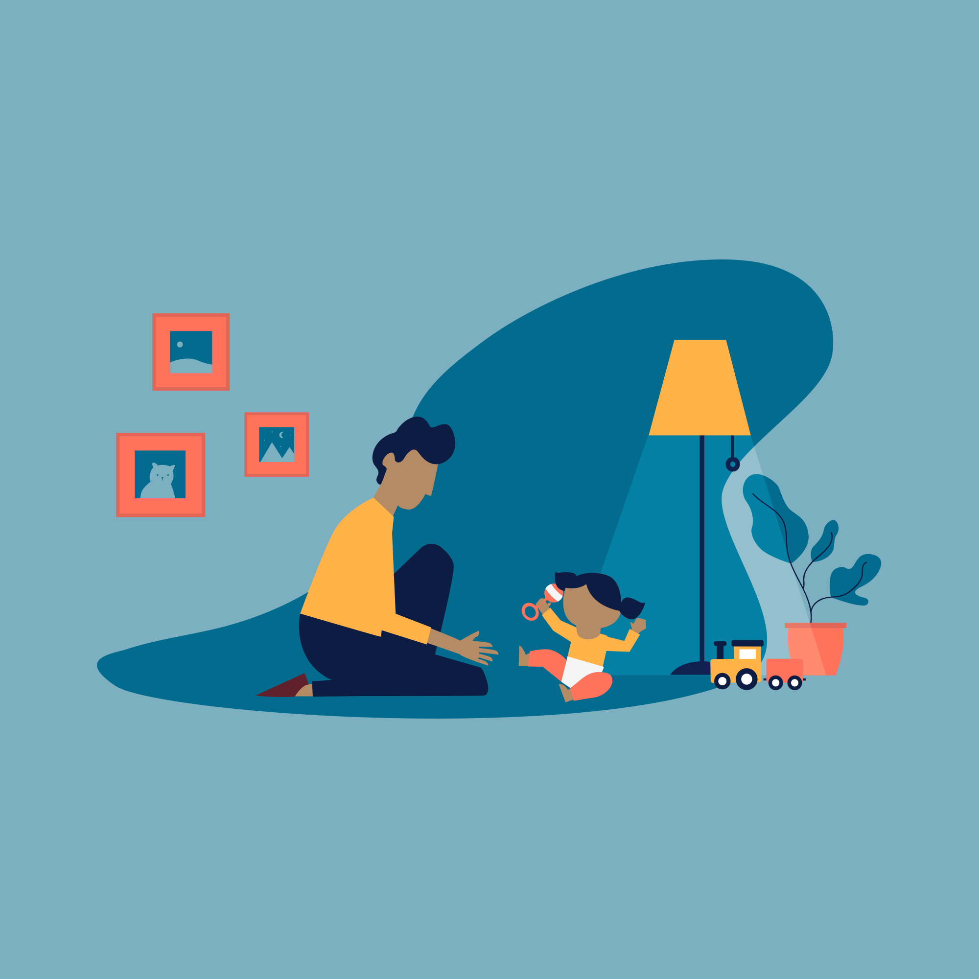
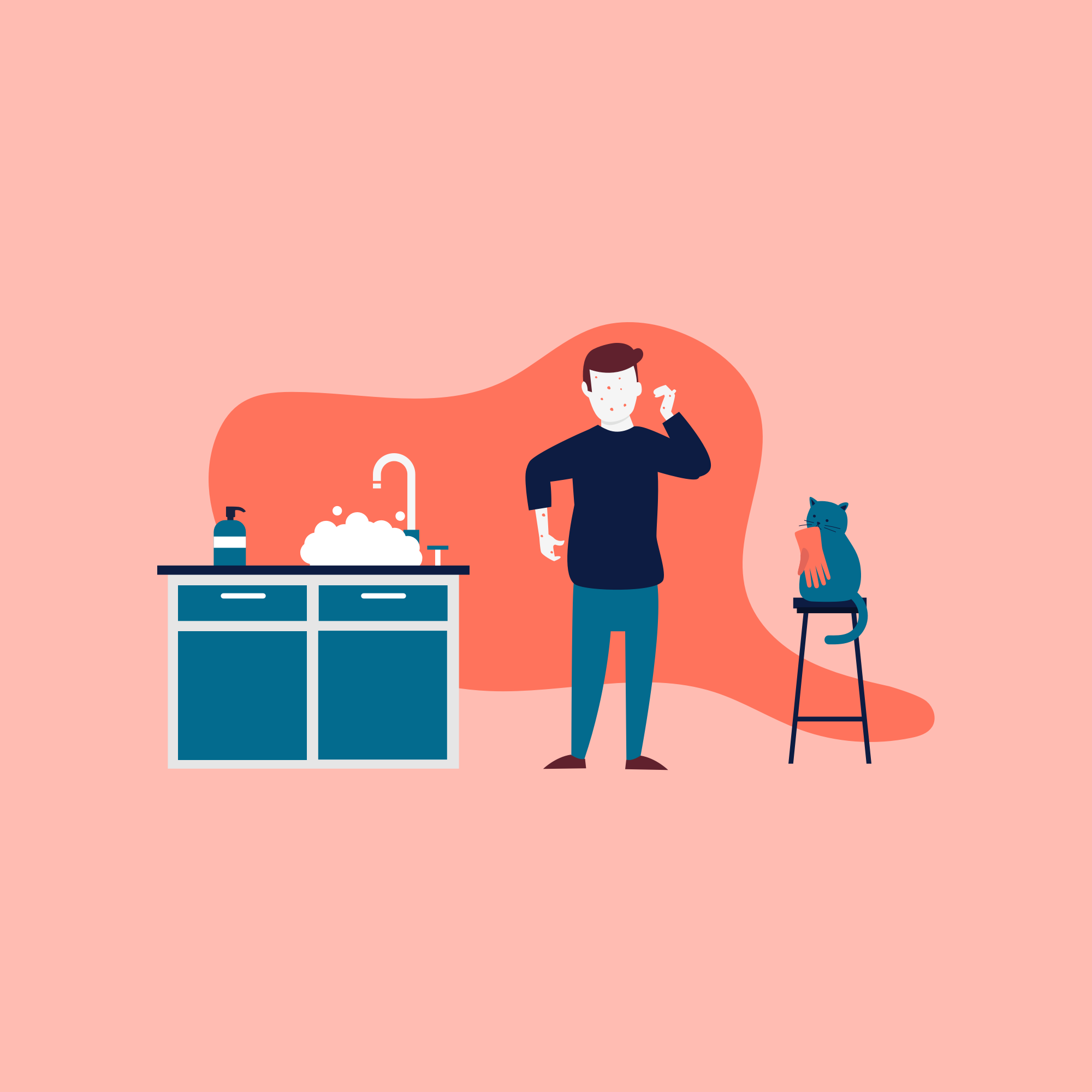
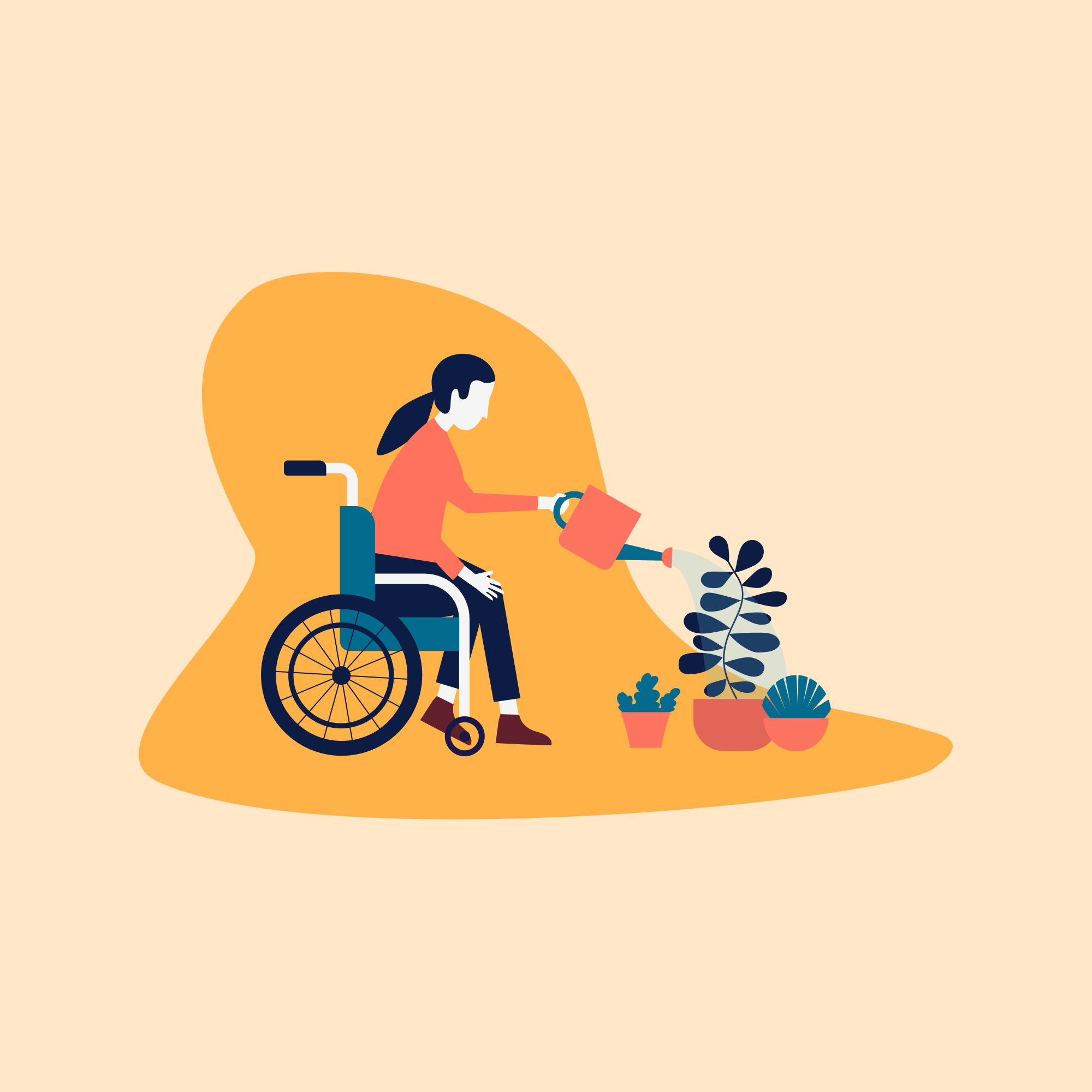
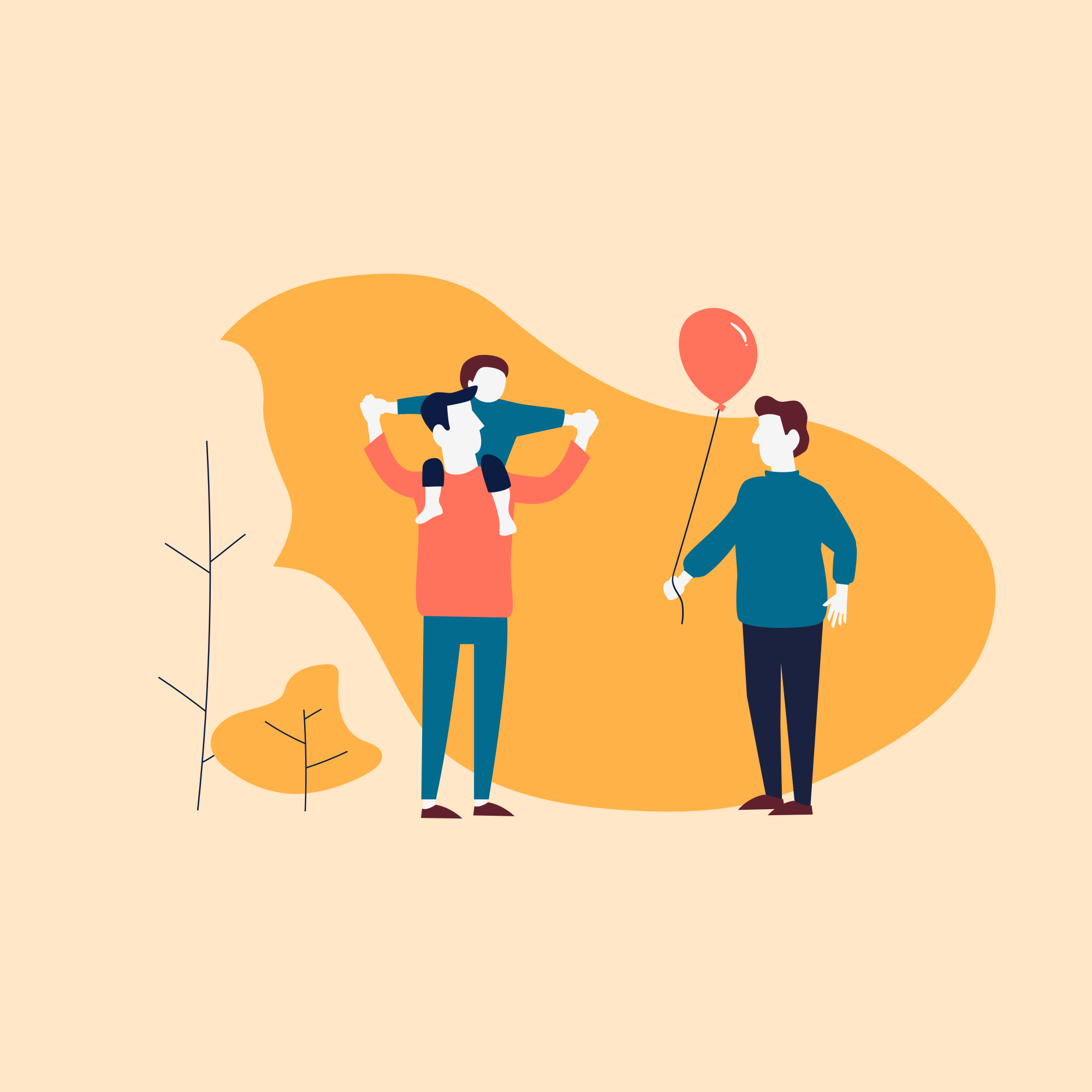
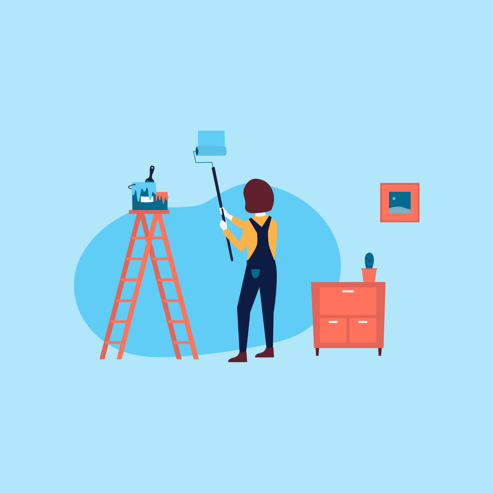
Illustrations
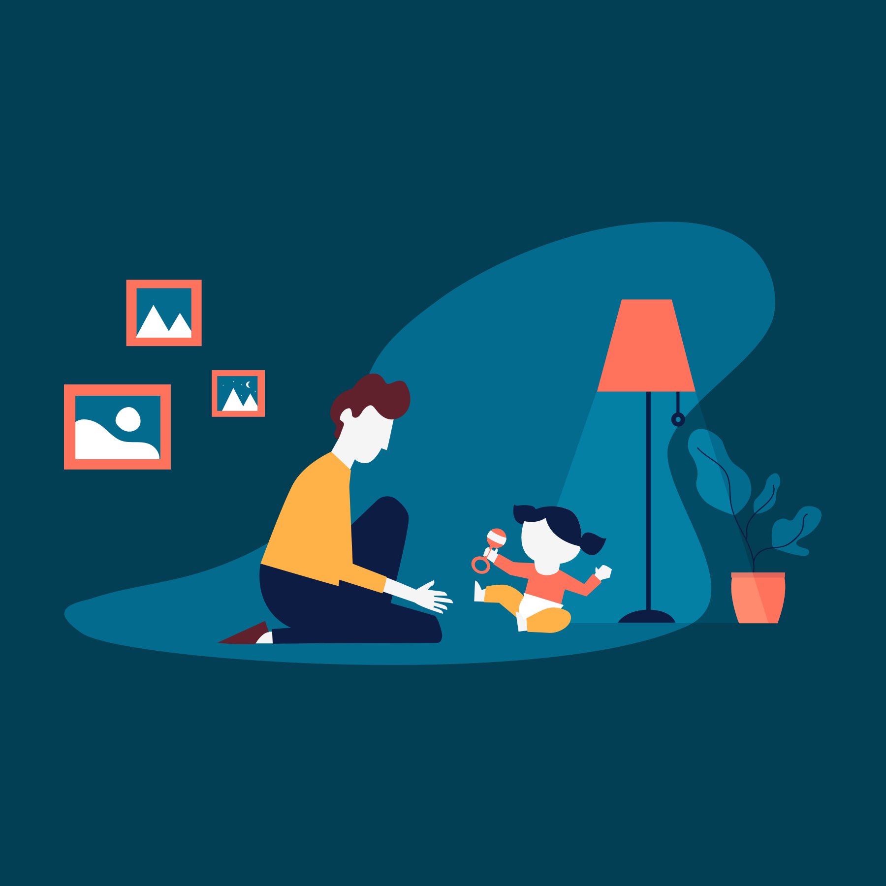
When creating interactive onboarding block, I needed to make six new illustrations. To make it playful, I wanted to animate them. It was fun to make those together with the developer. The animations are made subtle, so there was no need for a pause button.
Learnings
While working on waarzitwatin.nl, I learned how to integrate accessibility in my workflow. It shouldn't be something that we do afterward, but something that we always keep in mind. Also, I enjoyed working with CSS animations.